
At Harver, our mission is to help companies make faster, better, and fairer hiring decisions. But improving the hiring process doesn’t just mean optimizing assessments or reducing time-to-hire — it also means refining every interaction users have with our platform.
That’s why every Wednesday, one of our product designers hosts a 15-minute session to share UX insights with the broader product and development team. Because at the end of the day, great hiring software is built by teams who understand design deeply — and believe that everyone is a designer.
Why Change Blindness Matters in Hiring Technology
One of those sessions focused on a subtle but critical concept in user experience design: change blindness — our tendency to miss small but meaningful changes in a visual scene, especially when we’re not paying full attention. This phenomenon recently surfaced during a project to improve how users select candidate rejection reasons in the Harver platform.
The Challenge: Mandatory Rejection Reasons
Harver provides assessments — from personality to language tests — to help speed up and improve the hiring process. On the platform you can change the status of the candidates who took these assessments, say from new to short listed, or from new to rejected.
Many of our enterprise clients in retail hiring wanted a simple feature: make it mandatory to select a rejection reason when turning down a candidate. This kind of transparency helps standardize hiring decisions and supports fair hiring practices.
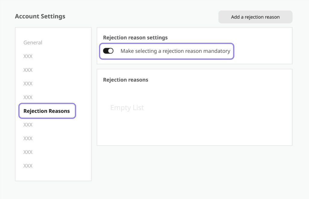
Since Harver already allows clients to customize rejection reasons in their account settings, our first instinct was to just add a toggle: make rejection reasons required when rejecting a candidate.
The Catch: You Can’t Require What Doesn’t Exist
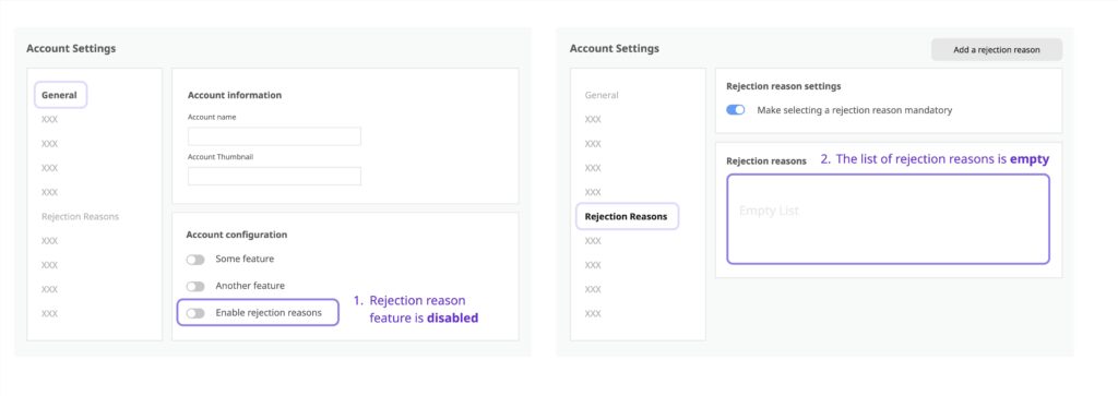
Our engineers quickly spotted a problem: the toggle wouldn’t make sense if either:
- The rejection reason feature wasn’t enabled, or
- The rejection reason list was empty.
We had to warn users about these preconditions — but how?
We considered some alternative solutions but ultimately settled on the simplest approach: warning messages.
But now we had a new question at hand: Do we show one warning at a time, or show all applicable warnings at once?
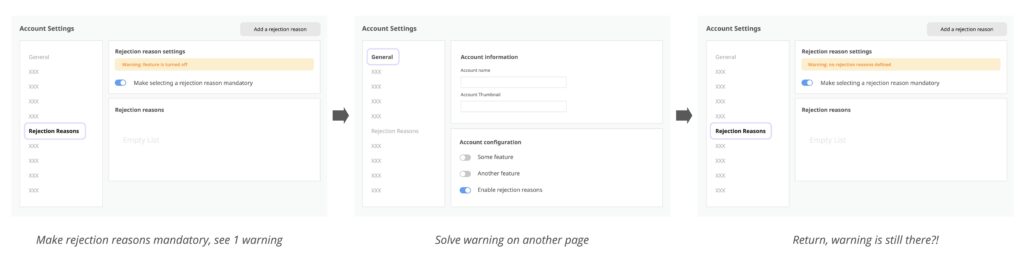
We chose to show one warning message at a time: first warn users if the rejection reason feature was turned off, and only if the feature was on, warn them about the empty list.
We thought this would help users focus on the most important problem first.
But would users actually notice the change?
The Test: UX in Action
As part of the delivery process, we conducted usability tests. Participants in these tests consistently behaved the same way. They enabled the “mandatory” toggle, saw the first warning, and navigated to settings to address it. When they returned, a new warning appeared — but many users didn’t realize it was a different message. This confusion led to frustration and confusion.
This is change blindness in action. Despite their best intentions, users didn’t notice the new message because their attention was focused elsewhere — solving the previous problem.
A Quick Theory Break: What is Change Blindness?
Many of you may already be familiar with Daniel Simons’ famous Monkey Business Illusion. In the video, viewers are asked to count basketball passes while a person in a gorilla suit walks through the scene. About half of viewers never notice the gorilla — their attention is elsewhere.

This is inattentional blindness — a close cousin of change blindness, which describes our broader struggle to notice changes in visual scenes. Change blindness happens when we do not pay enough visual attention to a stimulus – for example when an object is not relevant to our current task (like the gorilla).
In both cases, the lesson is clear: attention is a limited resource. We can only deeply process a limited number of stimuli. So our brains have to make decisions about what to pay attention to, and how much attention to pay to each thing.
When designing hiring platforms, we can’t assume users will notice subtle visual changes — especially when they’re focused on something else.
The Fix: Make Changes More Visually Obvious
So we iterated. One thing is that we should assume our users are at best paying partial attention to the interfaces we design. The lack of attention means they are likely to miss smaller changes in the interface.
Practically, anything we can do to make changes more obvious will help them. For example, using color changes and animation helps draw attention to the change. Reducing the number of elements (stimuli) users have to process provides another way to focus their attention.
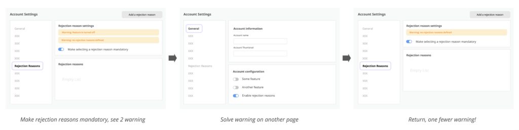
In our case we decided to show both warnings at once instead of switching out warning messages. This way, when a user fixed an error, the effect of their action was easier to notice. Instead of a change in text, there was now one fewer warning message on the page.
This change dramatically improved user comprehension. With both issues visible together, users could easily see what still needed to be fixed.
UX Takeaways for Hiring Platforms
- Assume partial attention: Recruiters, hiring managers, and talent acquisition teams using hiring software are often multitasking. Design with that in mind.
- Prioritize visual clarity: Use color, spacing, and animation to signal change. Don’t rely solely on text updates.
- Stack warnings when appropriate: In complex workflows like hiring pipelines, showing all relevant messages at once can reduce confusion and speed up resolution.
Final Thoughts: Design is a Hiring Advantage
User experience isn’t just about aesthetics — it directly impacts hiring efficiency. If a user misunderstands a warning or misses a system message, it can delay decisions, frustrate teams, and create inconsistency in candidate evaluation.
By understanding human limitations like change blindness, we can design hiring software that works with — not against — the realities of human attention.
Interested in building smarter hiring workflows? Schedule a demo to see how Harver’s UX-first approach helps companies make better talent decisions, faster.